The sections below cover some of the more important technical aspects and considerations of accessibility when curating or creating an OER.
Curators and Creators are strongly encouraged to enroll in the ASCCC self-paced Accessibility Basics Course.
Another resource to consider is Butte College's OER and ZTC for Faculty: Accessibility page for an array of resources intended for use by community college faculty who are developing resources
We want all textbooks and other educational materials created to be usable by all our students. Legally, this means the materials should be compliant with the Americans with Disabilities Act and Section 508 of the Rehabilitation Act of 1973. ADA and Section 508 compliance allow more students to access open educational resources and should be prioritized during formatting. The following pages describe key aspects of compliance applied to several file types.
Often, OER specialists will initially format in Word and then convert the file to a PDF. While Word does have an accessibility checker, the PDF accessibility checker is often used as the final test of a document's accessibility.
Documents created in Microsoft Word and Google docs can be quite accessible, but there are some tips that OER authors should use to ensure that the documents they create will not only be accessible in Word but also be accessible when transformed into other formats (Web pages, PDF documents, braille documents). To easily build accessible documents in Word (and other word-processing tools like Google docs and Open Office), the writer will need to become familiar with the editing toolbars. Using the proper styles "tags" the document with hidden code that makes the document understandable to screen reader software.
The basic tips to keep in mind include the following:
- Use styles to denote headings.
- Use list styles to create numbered and bulleted lists.
- Provide alternative text for all images.
- Ensure headers within tables are tagged.
- Ensure adequate color contrast between all text and the background.
- Use tabs, not spaces to move words.
Tutorials
While word processing software used to vary dramatically, Word for Windows, Word for the Mac, and Google docs actually function very similarly! Here are a few terrific videos that will help the writer get a bird's eye view of making documents accessible, and for Word users, a terrific online resource that should be bookmarked for future use:
To better understand the guidelines for designing electronic documents, please watch the following video presented by the OEI as an introduction to basic accessibility in MS Word:
Basic Accessibility in MS Word
Headings within a document--whether Word, Google Doc, PowerPoint, or PDF--should be used to separate content into "chunks" by identifying the main ideas or concepts of the page. Headings also identify a change in the flow of information on the page and allow individuals to visually scan the document for the desired information.
From an accessibility perspective, properly formatted headings are valuable as they provide individuals using screen readers with a simple method to navigate within a document. Rather than reading line-by-line through a document or web page, the use of headings allows individuals to move through the information based on heading topic.
To help students get the most from headings, follow these three rules:
- Ensure the headings are logical and descriptive.
- There should only be one Level 1 Heading.
- Use Level 2 Headings as the main topics. (A page may only require h2s.)
- Use Level 3 for subtopics.
- Use Styles to denote headings.
- Maintain the semantic structure of the headings (don't skip levels).
Windows
To create headings in Word 2016 for Windows:
- Highlight the text that will be the heading (or place the cursor within the text).
- In the Home tab, select the appropriate heading style from the Styles.
Additional Windows Resources
Mac
To create headings in Word 2016 for the Mac:
- Highlight the text that will be the heading (or place the cursor within the text)
- In the Home tab, select the appropriate heading style from the Styles.
Additional Mac Resources
Google Docs
To create headings in Google Docs:
- Highlight the text that will be the heading (or place the cursor within the text)
- From the menu bar, select the Styles drop-down menu, and then select the appropriate heading level.
Styles can also be accessed from the Format menu.
Additional Google Resources
- Google support: Make documents accessible
- Google support: Add a title, heading or table of contents to a document
Lists can help transform dense sentences or paragraphs by making the material more visually accessible. Lists are terrific ways to:
- present related ideas to students;
- illustrate items in a group;
- present pieces of a series; or
- outline steps in a process.
They also capitalize on white space, which can help make the content more visually appealing.
To make a list accessible, however, please ensure to use the list style. Simply adding sequential numbers or bullet icons before each line of text or item in the list does not make the list accessible.
Windows
To create a list using Word for Windows:
- Enter each item in the list (separate items with a return).
- Highlight all the items in the list.
- Choose either bulleted or numbered list from the formatting ribbon.
Additional Windows Resources:
Mac
To create a list using Word 2016 for Mac:
- Enter each item in the list (separate items with a return).
- Highlight all the items in the list.
- Choose either bulleted or numbered list from the formatting ribbon.
Additional Mac Resources:
To create a list using Google docs:
- Enter each item in the list (separate items with a return).
- Highlight all the items in the list.
- Select Format, then list.
- Choose the list style.
Additional Google Resources
Google support: Add a bulleted or Numbered List
Google Docs: Working with Lists (video)
While hyperlinks are a helpful and simple way to quickly direct students to web-based resources, they can pose accessibility challenges when the purpose and destination of the links are unclear to screen reader users. Screen readers will identify all the links in the document and present them in an alphabetical list for easy navigation, but the links need to be descriptive. To make the links accessible to every student, follow these rules:
- Identify the purpose or function of the hyperlink as part of the hyperlink name.
- Be as descriptive as possible without being overly long--the user will have to listen to the whole link before moving to the next link on the list.
- Integrate the link into a sentence--sighted users will see the link, and screen readers will identify the link.
There are also a few things to avoid. Avoid using vague or repeated text for hyperlinks, such as Click Here, Read more, or Link. In addition, in keeping with the idea of being descriptive, links should not be URLs. Not only are most URLs not descriptive, they are usually very long.
Additional Hyperlinks Resources
Windows
To insert a hyperlink:
- Copy the URL of the linked website.
- Highlight the phrase that will be the link text (remember to follow guidelines for link text).
- Select Insert from the menu bar, select links/Hyperlink(depending on the size of the menu tab).
- Paste the URL into the Address field of the dialog box, then select OK.
Additional Windows Resources
Mac
To insert a hyperlink:
- Copy the URL of the linked website.
- Highlight the phrase that will be the link text (remember to follow guidelines for link text).
- Select Insert from the menu bar, and then Hyperlink.
- Paste the URL into the Address field, then select OK.
Additional Mac Resources
To insert a hyperlink:
- Copy the URL of the linked website.
- Highlight the phrase that will be the link text (remember to follow guidelines for link text).
- Select Insert from the menu bar, and then select Link...
- Paste the URL into the Link field, then select Apply.
Because it is web-based, Google Docs will also allow one to search for an appropriate link, and even make suggestions for links. This can be handy if one is not sure of the resource to which they would like to link, but be sure to check out Google's suggested link! Remember, the linked site needs to be accessible, too!
Additional Google Resources
How to Create Internal Links in Google DocsLinks to an external site.
Including Images with Alt Text
To ensure a document is accessible, it's important to add a text description to images. This allows individuals who are visually impaired or blind using screen-reader software to "hear" the description of the image. Additionally, for individuals who are using a text-only Web browser or other mobile device, the text description still provides access to the information when the images are not displayed.
| ** IMPORTANT ** |
| As a reminder, adding alternative text is required under the WCAG 2.0, Level ALinks to an external site., and the Section 508 StandardsLinks to an external site.. |
There are scenarios where descriptive alt text is not required--sometimes an image is just there for visual appeal. It's purely decorative. In this case, alt text is not necessary, as the image has no value in helping a student using assistive technology to understand the information being presented. Many images, however, have a pedagogical purpose, and, therefore, require a description explaining the information the image conveys.
When providing alternative text for images, the CCC High Tech Center Training Unit offers the following guidelines:
- Keep the alternative text brief (10 words or less), but be descriptive.
- If there is text content in the image, include the exact text in the alternate text box.
- Do not use the word "image" to begin the description - instead identify the type of image being used if it is relevant to the image content (e.g., photograph, painting, screenshot).
- If the image is very detailed and cannot be summarized in a few sentences, consider placing additional information about the image into the page text preceding or following the image.
| Tab Shown on Load | 1 |
|---|---|
| Heading | Content |
| Windows |
WindowsAlt Text in Word for Windows To set the alt text on an image:
|
Mac |
MacTo set the Alt Text in Word 2016 for the Mac:
Additional Mac ResourcesMicrosoft Support: Make Word documents accessibleLinks to an external site. |
|
To set the Alt Text in Google docs:
Additional Google ResourcesGoogle Doc Alt Text Video |

Tables
To ensure students can navigate through a table with ease, all tables should be formatted for optimal use with a screen reader, including properly denoting the table header row. Remember, the header row allows the screen reader to keep track of where it is within the table, providing valuable information that allows visually impaired students to better understand the table. To maximize the clarity of the table, it's important to avoid nested tables (a table within a table), split and merged cells, and empty cells.
| Tab Shown on Load | 1 |
|---|---|
| Heading | Content |
| Windows |
WindowsFormatting Tables
Additional Windows Resources |
| Mac |
MacTo insert a table in Word for Mac 2016:
If the table is longer than one page or breaks across two pages, Please ensure the header row is repeated on the second page. This will make the table more usable for both sighted and visually impaired students. To repeat the header row:
Additional Mac Resources
|
|
Google Tables are not currently accessible, as a header row cannot be delineated. Additional Google Resources |
In this section, we provide guidelines and recommendations about color contrast in your open educational materials.
What is color Contrast?
color contrast includes: hue, lightness and saturation of text, images, and background File types: .doc, .html, .pdf, .jpg, .gif
What What Role Does color Play in the Delivery of Your Content?
When documents or web pages do not provide enough contrast between foreground elements (e.g., text, images) and background elements (e.g., color, watermark images), some students will have difficulty reading the content. Consider the following questions:
1. Have you presented text- or image-based content on a colored or textured background? If so, you should:
- Confirm that there is sufficient contrast between your foreground content and the chosen background color or texture.
2. Have you included links in your content? If so, you should:
- Confirm that the color of your web links is distinct from both your background color and the color of the surrounding text.
3. Have you used color to convey concepts or information? If so, you should:
- Confirm that you are not using color alone to convey this information.
Who Are You Doing This For?
This work supports students who:
- Have low vision
- Have poor contrast vision
- Are color blind and cannot differentiate between certain colors
- Are using a device with monochrome display
What Do You Need To Do?
Contrast
Students with low vision and/or a form of color blindness may have difficulty reading text that does not contrast enough with the background color you have selected. If the color palette you have adopted is too subtle (e.g., white text on a pastel background; medium-grey text on a light-grey background), the contrast between your foreground and background is probably insufficient for some students.
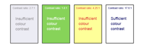
Web Content Accessibility Guidelines (WCAG 2.0) require that "the visual presentation of text and images of text has a contrast ratio of at least 7:1."[15] The image below presents four different foreground/background color-contrast examples to illustrate insufficient and sufficient color contrast ratios.
|
Not sure how to test your materials for color contrast ratios? There are many online and downloadable tools available to help you evaluate color contrast ratios. Here are a few we have tried and like:
|
Weblink colors
Weblinks must be visually distinct from both the surrounding, non-linked text and background color. If you do not underline your links (or provide some other non-color cue), you must ensure that you provide both sufficient contrast between the link and background colors and between the link color and that of the surrounding text.
Web Content Accessibility Guidelines (WCAG 2.0) require a:
- 4.5:1 contrast between the link text color and the background
- 3:1 contrast between the link text color and the surrounding non-link text color[16]
High-Contrast Mode
Some students need to see light text on a dark background for it to be readable, while others require dark text on a light background. Students with low vision must be able to see content when it is displayed in high-contrast mode. This can be a subjective experience, based on individual student needs. We recommend that you try testing your text and image-based content as you go by using high-contrast mode on your own computer and making adjustments as needed.
All content items such as text, images, bullets, and table borders must be visible in both regular and high-contrast modes.
|
Not sure how to test your content in high-contrast mode? To test the visibility of your content in this mode, turn on high contrast by simultaneously pressing the following keys on your (PC) keyboard:
To turn off high contrast mode, repeat this step. |
Use of color
You should not rely on color as the sole means of conveying information and instruction. If the point you are making depends on color to be understood, you will need to edit your materials so that concepts presented in the visuals are not lost to those who are color blind or who require high contrast between colors.[17]
In this section, we provide guidelines and recommendations about color contrast in your open educational materials.
What is color Contrast?
color contrast includes: hue, lightness and saturation of text, images, and background File types: .doc, .html, .pdf, .jpg, .gif
What What Role Does color Play in the Delivery of Your Content?
When documents or web pages do not provide enough contrast between foreground elements (e.g., text, images) and background elements (e.g., color, watermark images), some students will have difficulty reading the content. Consider the following questions:
1. Have you presented text- or image-based content on a colored or textured background? If so, you should:
- Confirm that there is sufficient contrast between your foreground content and the chosen background color or texture.
2. Have you included links in your content? If so, you should:
- Confirm that the color of your web links is distinct from both your background color and the color of the surrounding text.
3. Have you used color to convey concepts or information? If so, you should:
- Confirm that you are not using color alone to convey this information.
Who Are You Doing This For?
This work supports students who:
- Have low vision
- Have poor contrast vision
- Are color blind and cannot differentiate between certain colors
- Are using a device with monochrome display
What Do You Need To Do?
Contrast
Students with low vision and/or a form of color blindness may have difficulty reading text that does not contrast enough with the background color you have selected. If the color palette you have adopted is too subtle (e.g., white text on a pastel background; medium-grey text on a light-grey background), the contrast between your foreground and background is probably insufficient for some students.
Web Content Accessibility Guidelines (WCAG 2.0) require that "the visual presentation of text and images of text has a contrast ratio of at least 7:1."[15] The image below presents four different foreground/background color-contrast examples to illustrate insufficient and sufficient color contrast ratios.
|
Not sure how to test your materials for color contrast ratios? There are many online and downloadable tools available to help you evaluate color contrast ratios. Here are a few we have tried and like:
|
Weblink colors
Weblinks must be visually distinct from both the surrounding, non-linked text and background color. If you do not underline your links (or provide some other non-color cue), you must ensure that you provide both sufficient contrast between the link and background colors and between the link color and that of the surrounding text.
Web Content Accessibility Guidelines (WCAG 2.0) require a:
- 4.5:1 contrast between the link text color and the background
- 3:1 contrast between the link text color and the surrounding non-link text color[16]
High-Contrast Mode
Some students need to see light text on a dark background for it to be readable, while others require dark text on a light background. Students with low vision must be able to see content when it is displayed in high-contrast mode. This can be a subjective experience, based on individual student needs. We recommend that you try testing your text and image-based content as you go by using high-contrast mode on your own computer and making adjustments as needed.
All content items such as text, images, bullets, and table borders must be visible in both regular and high-contrast modes.
|
Not sure how to test your content in high-contrast mode? To test the visibility of your content in this mode, turn on high contrast by simultaneously pressing the following keys on your (PC) keyboard:
To turn off high contrast mode, repeat this step. |
Use of color
You should not rely on color as the sole means of conveying information and instruction. If the point you are making depends on color to be understood, you will need to edit your materials so that concepts presented in the visuals are not lost to those who are color blind or who require high contrast between colors.[17]
In this section, we provide guidelines and recommendations about color contrast in your open educational materials.
What is color Contrast?
color contrast includes: hue, lightness and saturation of text, images, and background File types: .doc, .html, .pdf, .jpg, .gif
What What Role Does color Play in the Delivery of Your Content?
When documents or web pages do not provide enough contrast between foreground elements (e.g., text, images) and background elements (e.g., color, watermark images), some students will have difficulty reading the content. Consider the following questions:
1. Have you presented text- or image-based content on a colored or textured background? If so, you should:
- Confirm that there is sufficient contrast between your foreground content and the chosen background color or texture.
2. Have you included links in your content? If so, you should:
- Confirm that the color of your web links is distinct from both your background color and the color of the surrounding text.
3. Have you used color to convey concepts or information? If so, you should:
- Confirm that you are not using color alone to convey this information.
Who Are You Doing This For?
This work supports students who:
- Have low vision
- Have poor contrast vision
- Are color blind and cannot differentiate between certain colors
- Are using a device with monochrome display
What Do You Need To Do?
Contrast
Students with low vision and/or a form of color blindness may have difficulty reading text that does not contrast enough with the background color you have selected. If the color palette you have adopted is too subtle (e.g., white text on a pastel background; medium-grey text on a light-grey background), the contrast between your foreground and background is probably insufficient for some students.
Web Content Accessibility Guidelines (WCAG 2.0) require that "the visual presentation of text and images of text has a contrast ratio of at least 7:1."[15] The image below presents four different foreground/background color-contrast examples to illustrate insufficient and sufficient color contrast ratios.
|
Not sure how to test your materials for color contrast ratios? There are many online and downloadable tools available to help you evaluate color contrast ratios. Here are a few we have tried and like:
|
Weblink colors
Weblinks must be visually distinct from both the surrounding, non-linked text and background color. If you do not underline your links (or provide some other non-color cue), you must ensure that you provide both sufficient contrast between the link and background colors and between the link color and that of the surrounding text.
Web Content Accessibility Guidelines (WCAG 2.0) require a:
- 4.5:1 contrast between the link text color and the background
- 3:1 contrast between the link text color and the surrounding non-link text color[16]
High-Contrast Mode
Some students need to see light text on a dark background for it to be readable, while others require dark text on a light background. Students with low vision must be able to see content when it is displayed in high-contrast mode. This can be a subjective experience, based on individual student needs. We recommend that you try testing your text and image-based content as you go by using high-contrast mode on your own computer and making adjustments as needed.
All content items such as text, images, bullets, and table borders must be visible in both regular and high-contrast modes.
|
Not sure how to test your content in high-contrast mode? To test the visibility of your content in this mode, turn on high contrast by simultaneously pressing the following keys on your (PC) keyboard:
To turn off high contrast mode, repeat this step. |
Use of color
You should not rely on color as the sole means of conveying information and instruction. If the point you are making depends on color to be understood, you will need to edit your materials so that concepts presented in the visuals are not lost to those who are color blind or who require high contrast between colors.[17]
In this section, we provide guidelines and recommendations about color contrast in your open educational materials.
What is color Contrast?
color contrast includes: hue, lightness and saturation of text, images, and background File types: .doc, .html, .pdf, .jpg, .gif
What What Role Does color Play in the Delivery of Your Content?
When documents or web pages do not provide enough contrast between foreground elements (e.g., text, images) and background elements (e.g., color, watermark images), some students will have difficulty reading the content. Consider the following questions:
1. Have you presented text- or image-based content on a colored or textured background? If so, you should:
- Confirm that there is sufficient contrast between your foreground content and the chosen background color or texture.
2. Have you included links in your content? If so, you should:
- Confirm that the color of your web links is distinct from both your background color and the color of the surrounding text.
3. Have you used color to convey concepts or information? If so, you should:
- Confirm that you are not using color alone to convey this information.
Who Are You Doing This For?
This work supports students who:
- Have low vision
- Have poor contrast vision
- Are color blind and cannot differentiate between certain colors
- Are using a device with monochrome display
What Do You Need To Do?
Contrast
Students with low vision and/or a form of color blindness may have difficulty reading text that does not contrast enough with the background color you have selected. If the color palette you have adopted is too subtle (e.g., white text on a pastel background; medium-grey text on a light-grey background), the contrast between your foreground and background is probably insufficient for some students.
Web Content Accessibility Guidelines (WCAG 2.0) require that "the visual presentation of text and images of text has a contrast ratio of at least 7:1."[15] The image below presents four different foreground/background color-contrast examples to illustrate insufficient and sufficient color contrast ratios.
|
Not sure how to test your materials for color contrast ratios? There are many online and downloadable tools available to help you evaluate color contrast ratios. Here are a few we have tried and like:
|
Weblink colors
Weblinks must be visually distinct from both the surrounding, non-linked text and background color. If you do not underline your links (or provide some other non-color cue), you must ensure that you provide both sufficient contrast between the link and background colors and between the link color and that of the surrounding text.
Web Content Accessibility Guidelines (WCAG 2.0) require a:
- 4.5:1 contrast between the link text color and the background
- 3:1 contrast between the link text color and the surrounding non-link text color[16]
High-Contrast Mode
Some students need to see light text on a dark background for it to be readable, while others require dark text on a light background. Students with low vision must be able to see content when it is displayed in high-contrast mode. This can be a subjective experience, based on individual student needs. We recommend that you try testing your text and image-based content as you go by using high-contrast mode on your own computer and making adjustments as needed.
All content items such as text, images, bullets, and table borders must be visible in both regular and high-contrast modes.
|
Not sure how to test your content in high-contrast mode? To test the visibility of your content in this mode, turn on high contrast by simultaneously pressing the following keys on your (PC) keyboard:
To turn off high contrast mode, repeat this step. |
Use of color
You should not rely on color as the sole means of conveying information and instruction. If the point you are making depends on color to be understood, you will need to edit your materials so that concepts presented in the visuals are not lost to those who are color blind or who require high contrast between colors.[17]
Color
There are a number of very important considerations when it comes to color: Contrast, Color Blindness, and Color Processing Issues.
When creating a document, always be very aware of contrast. It is generally best for readability not to overlay text on top of a busy graphic. Similarly, when using a colored background, make sure that the text contrasts strongly with the background. Never use light text on a light background (for instance yellow text on white) or dark text on a dark background (for instance black text on dark blue).
Also remember that a significant portion of the population has some degree of colorblindness (most often red/green). If green text is used for correct answers and red text for incorrect answers, some students may be completely lost. It is fine to use color as a reinforcement, as long as color is not the only indicator. For instance, have the word "correct" in green and "incorrect" in red.
It is quite common for students with vision issues, including visual processing issues, to be affected in some way by color. The nice thing about a fully accessible document is that the programs that students use to read the documents can alter the color as necessary.
Color Contrast
When possible, use the default settings for text colors. If using custom colors for headings or other textual markers, check the contrast via a free online color contrast tool. In order to test the colors, it is important to know the hex codeLinks to an external site. of the colors being used. Some recommended color contrast tools are:
- WebAim: Color Contrast CheckerLinks to an external site.
- ACART Communications: Contrast CheckerLinks to an external site.
Instructions for checking the contrast in a Word document:
Contrast in Microsoft WordLinks to an external site.
Attributions:
CVC-OEI Adoptable: Creating Accessible Course Content By Helen Graves. This work is licensed under a Creative Commons 4.0 International LicenseLinks to an external site.
Unit 6: Accessibility Continued--Document Design By Suzanne Delahanty. This work is licensed under a Creative Commons Public Domain Mark 1.0 LicenseLinks to an external site.
Accessible PDFs
The path to creating accessible documents is full of potholes. One particular issue is the software students will need to open a file--if they are provided with a Word document, they will need Word to read it. In addition, if their operating system or version of Word is not the same as the document creator's, there is no guarantee the document will look the same to them as it did to the person who created the file.
Converting Word, Google Docs, PowerPoint, and Google Slides documents (Excel and Google Sheets, too) to a PDF eliminates the software issue. With PDFs, students can download the free Adobe ReaderLinks to an external site., allowing universal access to the course material, and, the document will look exactly the same as when it was designed.
There is, however, a caveat:
The PDF is only as accessible as the original document.
In other words, an accessible PDF is built from an accessible Office or Google document. If the original file has an accessibility issue, that issue will be passed on in the PDF format. Additionally, sometimes new accessibility issues occur as the file is being rendering into the PDF format, so even if the Word document was 100% accessible, the PDF version may not be!
It's important to always check a PDF for accessibility and, if needed, remediate the accessibility issues in Adobe Acrobat ProLinks to an external site..
The following tabs on this page will provide guidance on converting Office for Windows files into PDFs, converting Office for the Mac, and converting Google docs. In the next section we'll cover using Adobe Acrobat Pro.
| Tab Shown on Load | 1 |
|---|---|
| Heading | Content |
| Windows |
WindowsThe beauty of the Microsoft products is their consistency. Whether converting a Word doc or PowerPoint, the process is going to be very similar:
It never hurts to check the final PDF, as well. In the next section, we'll learn more about assessing the accessibility of PDFs. Additional Windows ResourcesMicrosoft Office Tutorials: Save or Convert to PDFLinks to an external site. |
| Mac |
MacRemember, to end up with an accessible PDF, it is important to begin with an accessible file. In addition, if using any version of Microsoft Word for the Mac that is prior to 2016, the document cannot be converted to an accessible PDF from Word or PPT. The documents will need to be imported to another tool (Google docs or OpenOffice, for instance) in order to create an accessible PDF. For this reason, we strongly suggest all Mac users upgrade to MS Office for the Mac-2016. ** IMPORTANT INFORMATION ** We want to be very clear here. MS Office products designed for the Mac prior to 2016 will allow documents to be saved as PDFs, but, these PDFs are not accessible. This is because there are two types of PDFs--image only, and tagged. Image-only PDFs are like a picture of the original document. It looks the same, but the text has actually been changed to an image. The text cannot be edited, and, more importantly, the screen reader won't see text--instead, it will detect a single image. It is, essentially, a photo of the original document. Tagged PDFs, on the other hand, are text documents, and the 'tags' retain the important formatting information so useful to screen readers. In the MS Office for Mac products prior to 2016, the conversion process turned the original document into an image-only PDF--no text, no tags, just the image. It looked great, but it was useless to students using assistive technology. So, here's how to ensure MS Office for Mac documents are converted to accessible PDFs:
It never hurts to check the final PDF, as well. In the next section, we'll learn more about assessing the accessibility of PDFs.
|
|
To convert a Google doc to a PDF:
|
Retrofitting PDFs
For many years, there was an unfortunate myth floating around that the PDF format magically made documents accessible. Now, however, it's time to confront the skeletons in the closet, and check those old PDFs.
Never assume a PDF, even one that looks very professional, is accessible.
Checking PDFs
The best way to check a PDF is with Adobe Acrobat Pro. If using PDFs extensively, investing in this software could prove invaluable to a campus with OER specialists. Adobe Acrobat has a host of tools, including an Accessibility Checker. To run an accessibility report, open a PDF in Adobe Acrobat Pro:
- Select the Accessibility tool.
- Select Full Report from the menu bar.
- Select Start Checking.
The accessibility report will open in the left column. Follow the feedback to correct any errors.
Retrofitting
The approach to retrofitting PDFs will depend on whether the OER specialist owns the original source file that was converted to PDF. If they have the original file, that's where they'll start:
- Ditch the inaccessible PDF.
- Retrofit the original source file and format accordingly.
- If choosing to retrofit the original source file, after fixing any accessibility issues, convert the file to PDF.
If this is not the original source file, Adobe Acrobat Pro will be needed to make the file accessible:
- Open the file in Adobe Acrobat Pro.
- Run the Accessibility Check.
- Follow the tips generated by Adobe to fix any issues.
Using Adobe requires practice. They have some terrific web-based tutorials, included in the additional resources.